In a crowded market, the only way to truly stand out is to look, act and think differently.
That’s what we set out to do with AF Live.
https://aflive.co.uk
We are AF Live, the technical production experts.
It got us going. It struck a chord…
Initial disgussions with Paul Rose, Director of AF Live, involved re-designing the back and front-end of the AF Live website. We were instantly struck by not only the ridiculous talent they possessed but partner to this was their mindblowing achievements and proven track record. It really did get us instantly excited. We talked for hours with Paul and business partner Nikki, which felt like minutes. The shear scale of their knowledge and enthusiasim for sound and events was a joy to gain insight into and it left us thinking, these guys are massively under represented. It got us going. It struck a chord. We got off that call and assembled a team. This was going to be a deep dive, to extract, enhance and communicate all that they had.
… this insatiable drive to deliver the impossible.
This was no ordinary sound events company. Their beliefs, their passions, the extensive teams of proffessionals, followers and fanatics. This wasn’t just a business, it was a brand. There is a richness that goes with creating physical events, tangible experiences shared amongst others. I’ve experienced the industry first hand, when you get a pungent mix of creative professionals and technical wizards, the glue that binds them is this insatiable drive to deliver the impossible. Its a beautiful space to work in. We found ourselves slightly obsessed in the mission to translate every facet of thier talents within one identity and even better, concept.
4 dimensions of thought, something that pushed perceptions.
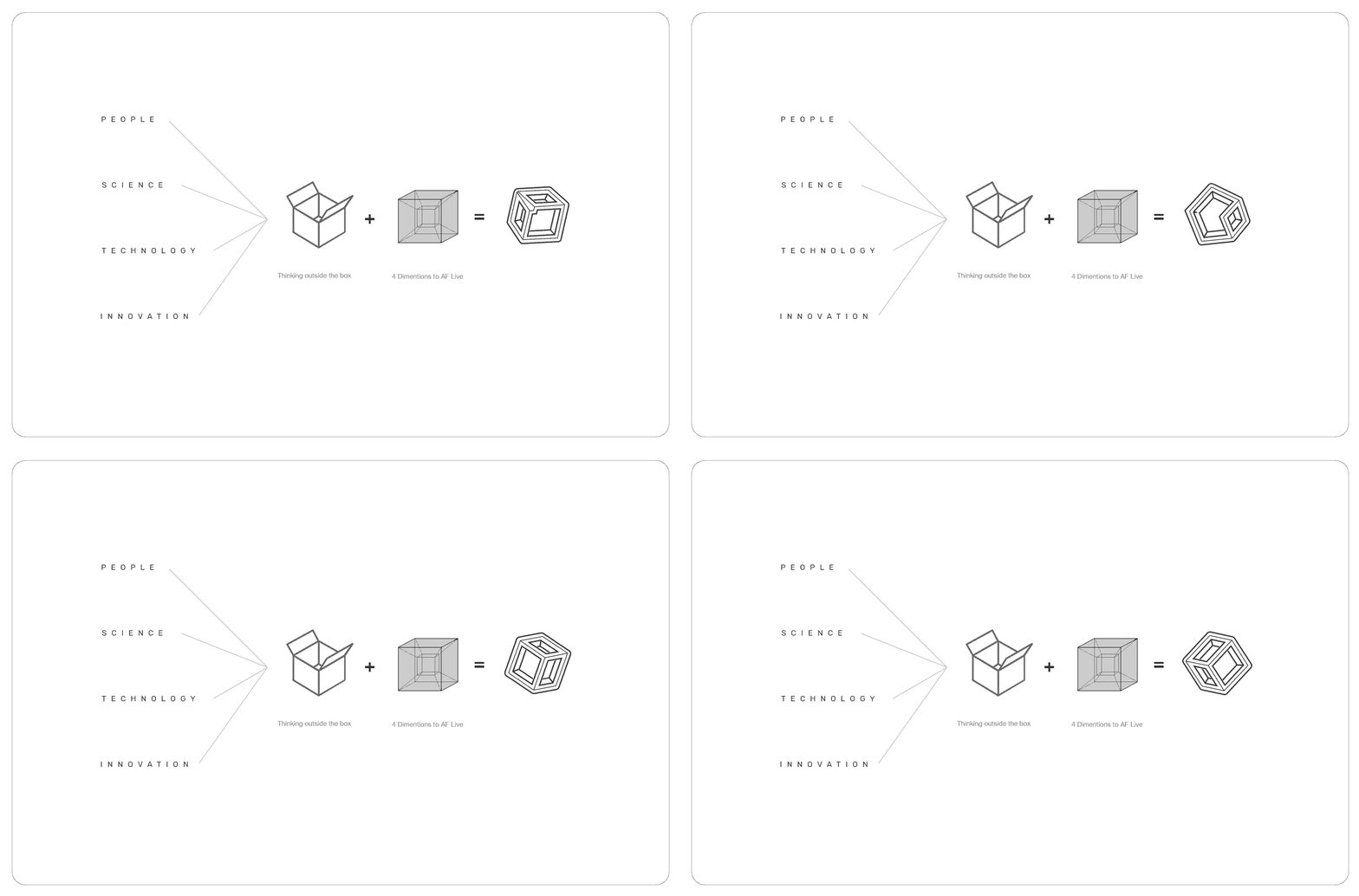
After a deep dive into the driving principles of the team, we decided to summarise. Within this was 4 glaring elements that formed the backbone of the business. Once we had this, then the visual design work began. We required something that represented 4 dimensions of thought, something that could push perceptions and form the cornerstone of the brand. The opitome of this, for us, was the Tesseract.
Tesseract: noun. In geometry, a tesseract is the four-dimensional analogue of the cube; the tesseract is to the cube as the cube is to the square.
… They tend to sit for eternity in the drawer of the employee. However, their business is different…
Business card design often seems to be almost a forced labour, in regards to the vast majority of businesses we work with. Often, rarely used they tend to sit for eternity in the drawer of the employee. However, their business is different. It takes them across the nation and abroad, interacting with vast numbers of individuals, teams, corporations and organisations. Not only that but they had some beautiful imagery that we just tweaked and reworked into the new brand design.
Its primary purpose is to aid in the easy identification of services…
Clean, strong, bold branding was the impetus for the new website design. It needed to look and feel different to the rest because AF Live didn’t act like the rest. This is is achieved through large shapes that cut through the web page feeding the natural flow of the eye. Top left to bottom right (scroll) Bottom left and down. Embellished with the vibrant new colour palette its primary purpose is to aid in the easy identification of services offered by the company of which, there are many.
Our approach was to provide two specific varieties of content
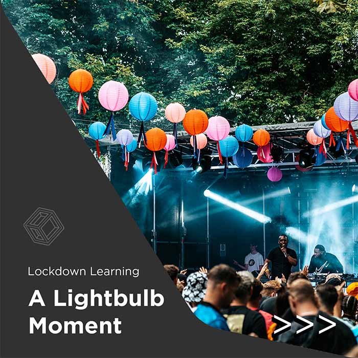
Its no secret that attention is harder and harder to grab, nowadays. To stand out in the world of online media, there are multiple methods of engagement. Our approach was to provide two specific varieties of content. One as social media posts designed to inform and serve as a resource and the other was the documentation of their events and achievements. We focussed on the former.
People
AF Live works closely with local music colleges and institutions so we thought this was worth shouting about. Young people get on-the-job experience and insight into some of the largest events in the UK.
Science
In our research into the company we found they had indepth knowledge of the physics behind what they did. Technical detailing was something we felt would be a great resource for potential clients and customers, on social media and their blog.
Technology
Always ahead of the curve, AF Live actually get given prototype sound systems to test for some of the most reputable companies in the world. We felt this was worth shouting about
Innovation
This word is often over used. However, in tech and the sciences, it is the only word that truly states the groundbreaking. AF Live always push to look for new ventures and as Paul once said ‘it gets said a lot but we genuinely love a challenge Aidy’.
We offer a free drafting process
Contact us to find out more
Designed by Aidy & Co
Let us guide you through the possibilities.


